ROC Curve
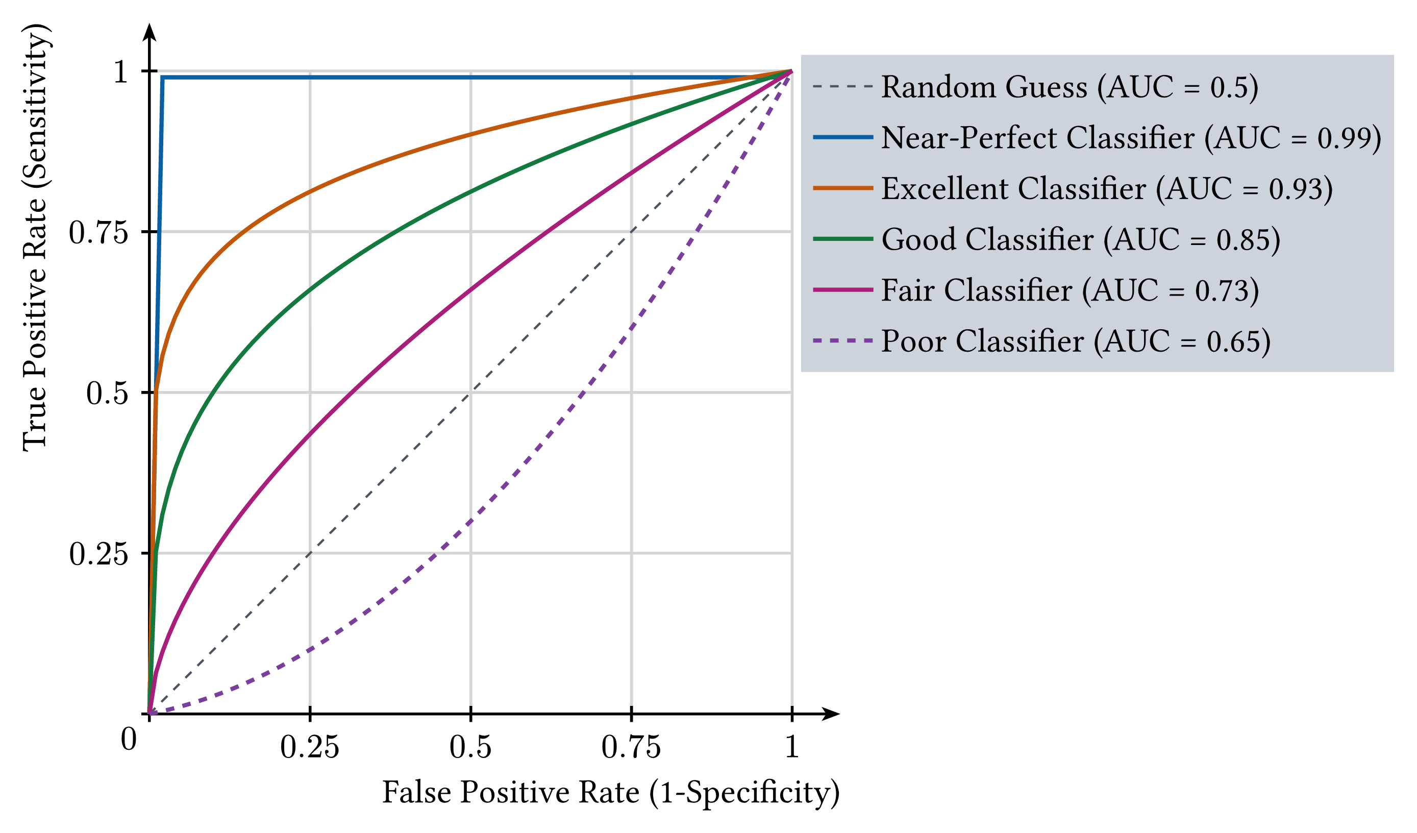
The Receiver Operating Characteristic curve plots the true positive rate (sensitivity) against the false positive rate (1 − specificity) as the classification threshold is swept. Six classifiers are shown, from near-perfect (AUC = 0.99) down to poor (AUC = 0.65), against the diagonal a random guess would trace (AUC = 0.5). The area under each curve summarizes performance independently of any single threshold, so the ordering of the curves holds however the operating point is later chosen.
Download
Code
roc-curve.typ (102 lines)
#import "@preview/cetz:0.5.2": canvas, draw
#import "@preview/cetz-plot:0.1.4": plot

#set page(width: auto, height: auto, margin: 8pt, fill: none)
#set text(size: 12pt)

// ROC curve functions for different classifiers
#let clamp-unit-interval(x, interior-value) = {
  if x <= 0 { return 0 }
  if x >= 1 { return 1 }
  interior-value
}

#let perfect-classifier(x) = if x == 0 { 0 } else if x == 1 { 1 } else if x > 0 { 0.99 } else { 0 }

#let excellent-classifier(x) = clamp-unit-interval(x, calc.pow(x, 0.15))
#let good-classifier(x) = clamp-unit-interval(x, calc.pow(x, 0.3))
#let fair-classifier(x) = clamp-unit-interval(x, calc.pow(x, 0.6))
#let poor-classifier(x) = clamp-unit-interval(x, 0.2 * x + 0.8 * x * x)

#let random-classifier(x) = x

#canvas({
  let axis-mark = (end: "stealth", fill: black, scale: 0.7)
  draw.set-style(axes: (
    x: (mark: axis-mark, label: (anchor: "south-east", offset: 1.2)),
    y: (mark: axis-mark, label: (anchor: "south-east", offset: 1.2, angle: 90deg)),
  ))

  plot.plot(
    size: (8, 8),
    x-label: "False Positive Rate (1-Specificity)",
    y-label: "True Positive Rate (Sensitivity)",
    x-min: 0,
    x-max: 1,
    y-min: 0,
    y-max: 1,
    x-tick-step: 0.25,
    y-tick-step: 0.25,
    x-grid: true,
    y-grid: true,
    axis-style: "left",
    legend: "inner-north",
    legend-style: (
      fill: rgb("#cdd3da"),
      item: (spacing: 0.15),
      padding: 0.15,
      stroke: none,
      offset: (7.8, 0.3),
    ),
    {
      let curves = (
        (
          func: random-classifier,
          samples: 2,
          stroke: (paint: rgb("#4A5560"), dash: "dashed", thickness: 0.8pt),
          label: "Random Guess (AUC = 0.5)",
        ),
        (
          func: perfect-classifier,
          samples: 50,
          stroke: rgb("#0B5FA5") + 1.5pt,
          label: "Near-Perfect Classifier (AUC = 0.99)",
        ),
        (
          func: excellent-classifier,
          samples: 100,
          stroke: rgb("#C2570A") + 1.5pt,
          label: "Excellent Classifier (AUC = 0.93)",
        ),
        (
          func: good-classifier,
          samples: 100,
          stroke: rgb("#12793F") + 1.5pt,
          label: "Good Classifier (AUC = 0.85)",
        ),
        (
          func: fair-classifier,
          samples: 100,
          stroke: rgb("#A81E7A") + 1.5pt,
          label: "Fair Classifier (AUC = 0.73)",
        ),
        (
          func: poor-classifier,
          samples: 100,
          stroke: (paint: rgb("#7A3E9D"), thickness: 1.5pt, dash: "dashed"),
          label: "Poor Classifier (AUC = 0.65)",
        ),
      )
      for curve in curves {
        plot.add(
          style: (stroke: curve.stroke),
          domain: (0, 1),
          samples: curve.samples,
          curve.func,
          label: curve.label,
        )
      }
    },
  )
})